I Hadn’t Written a Resume Since 2008—So I Coded One Instead
TL;DR: I needed a resume for the first time in years—so I built an interactive, data-driven Resume Viewer in React. It’s not just a PDF: it’s a web app th...

TL;DR:
I needed a resume for the first time in years—so I built an interactive, data-driven Resume Viewer in React.
It’s not just a PDF: it’s a web app that visualizes my experience, skills, and career journey with custom views, structured data, and transparent design.
Explore the prototype, see the code on GitHub, or contact me to learn more.
A few weeks ago, something hit me:
This was the first time since 2008 I actually needed a resume.
Not just to update one—but to truly use it. To stand out. To get noticed. To say, “Hey, here’s what I can do,” in a way that actually lands.
But after 20+ years of building software—scaling platforms, leading teams, and writing enough code to fill a small library—a two-page PDF just felt wrong. Flat. Lifeless.
So instead of formatting another résumé in Word…
I built one in React.
When I saw a job posting that really excited me, I started asking:
“How do I get someone to see me?”
“What can I create that shows—not tells—what I bring to the table?”
That was two weeks ago.
Since then, I’ve been sprinting.
Not on cover letters.
But on code.
I built a custom, interactive resume viewer using:
This isn’t just a resumé with animations. It’s a touchable artifact—a tool that lets employers feel how I think:
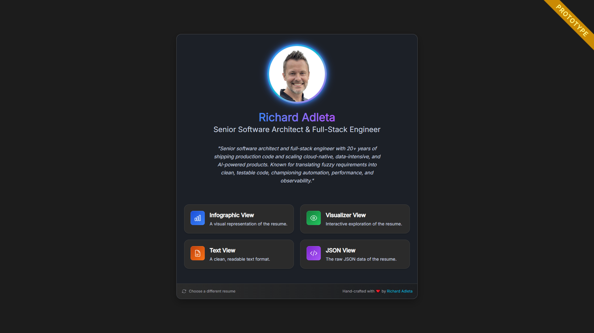
The Resume Viewer is more than a showcase—it’s a prototype web application designed to highlight my professional web development skills. It demonstrates my expertise in coding, UX design, and data analysis, while serving as a public portfolio piece for potential employers.
I built the Resume Viewer around four primary views—each with a different focus, each in various stages of completion. Each view is a different lens on my experience, and each is evolving as I experiment and get feedback.
“I built an animated timeline using D3.js that visualizes my career over time—something no PDF can ever do.”
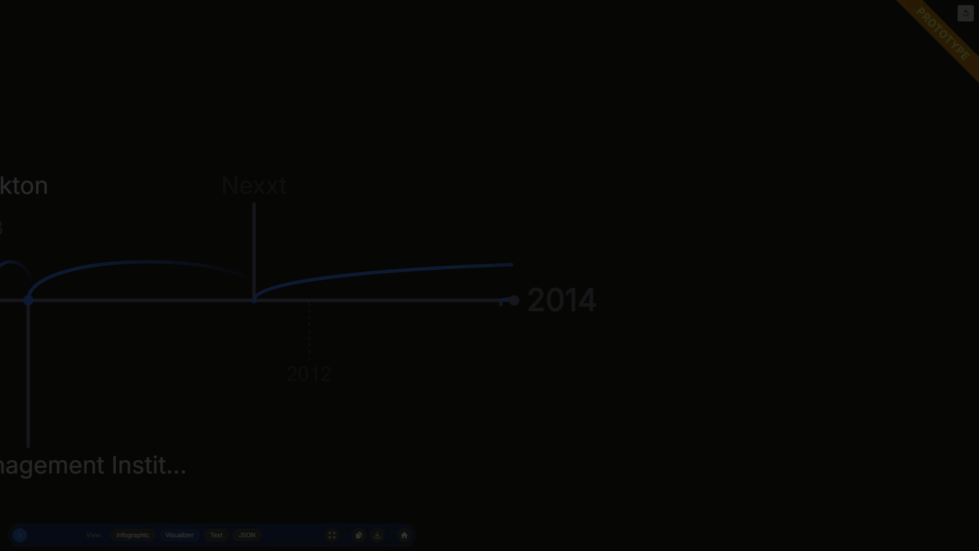
This is the heart of the project—a dynamic, D3.js-powered timeline that visualizes my career journey. Right now, you can zoom and pan across the years, and see how the companies I’ve worked at changed over time. But this is just the beginning.
Where I want to take it:
I’m aiming for a truly interactive experience. Imagine being able to click on a job title and have the timeline zoom in, revealing more granular details—projects, skills used, even key achievements—animated right into view.
I want subtle data overlays: maybe skill trends, company logos, or even animated transitions that help you feel the flow of my career, not just read about it. The goal is to make exploring a resume as engaging as browsing a well-designed dashboard.
“Printable, readable, and familiar. But with a twist.”
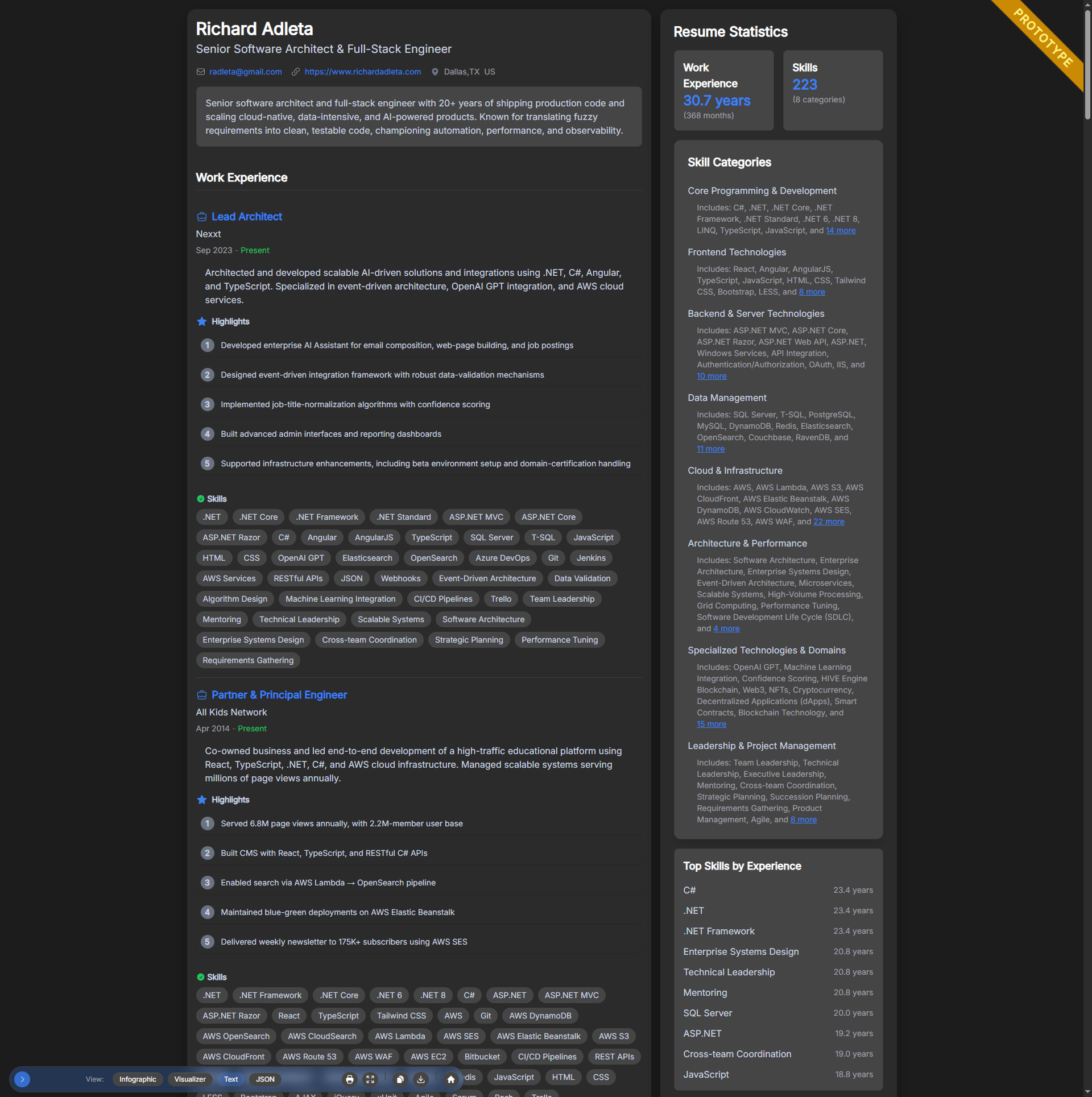
This is the “classic” resume, but with a twist. It’s clean and structured, but also data-enhanced: you’ll see inline skill analysis, job tagging, and timeline insights woven right into the text. It’s designed to be instantly familiar to hiring managers, but with richer context and smarter organization.
What’s next:
I want to add more dynamic features—like toggling between condensed and expanded job descriptions, highlighting skills as you hover, and surfacing quick stats (e.g., “Most-used tech at this company”). The idea is to keep it readable, but make it smarter and more interactive than any PDF.
“I needed to show you the concept, even before the pixels were perfect. Because good feedback comes early.”
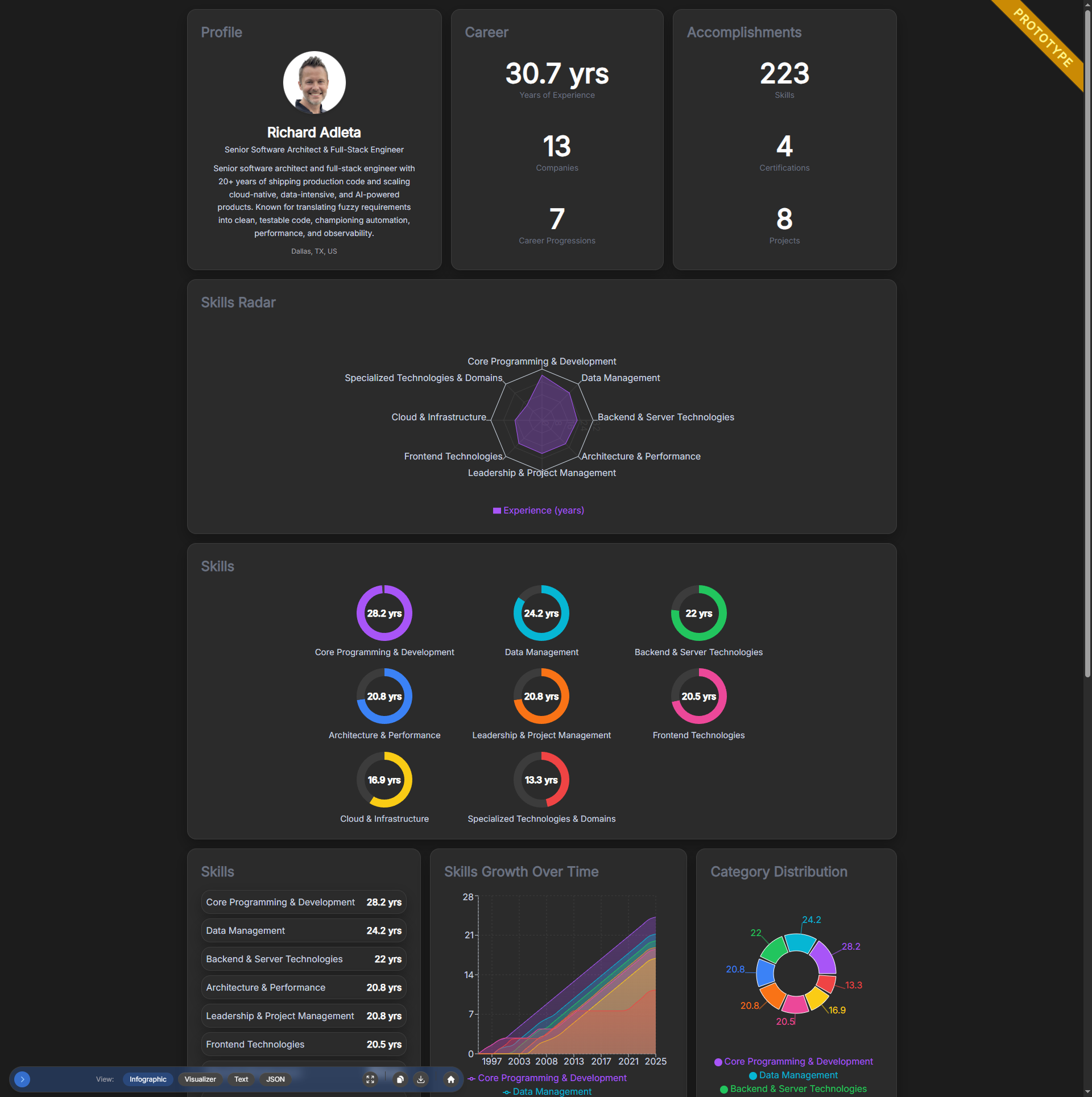
This is the least finished view, but intentionally so—what’s there now is a collection of early experiments, meant to show the many different ways resume data can be visualized. Think of it as a sandbox for ideas: company logos, skill maps, and role summaries, all in one place.
Where I want to take it:
My next step is to transform this into a true infographic of the person—something that instantly communicates high-level stats, number of jobs, years of experience, and top skills in a visually compelling way. But I don’t want it to stop at static charts. I want it to be interactive:
Ultimately, I want the infographic view to be the fastest way to “get” someone’s story—at a glance and in depth, with both style and substance.
“I believe in observability and transparency. This view exposes the underlying resume data powering everything.”
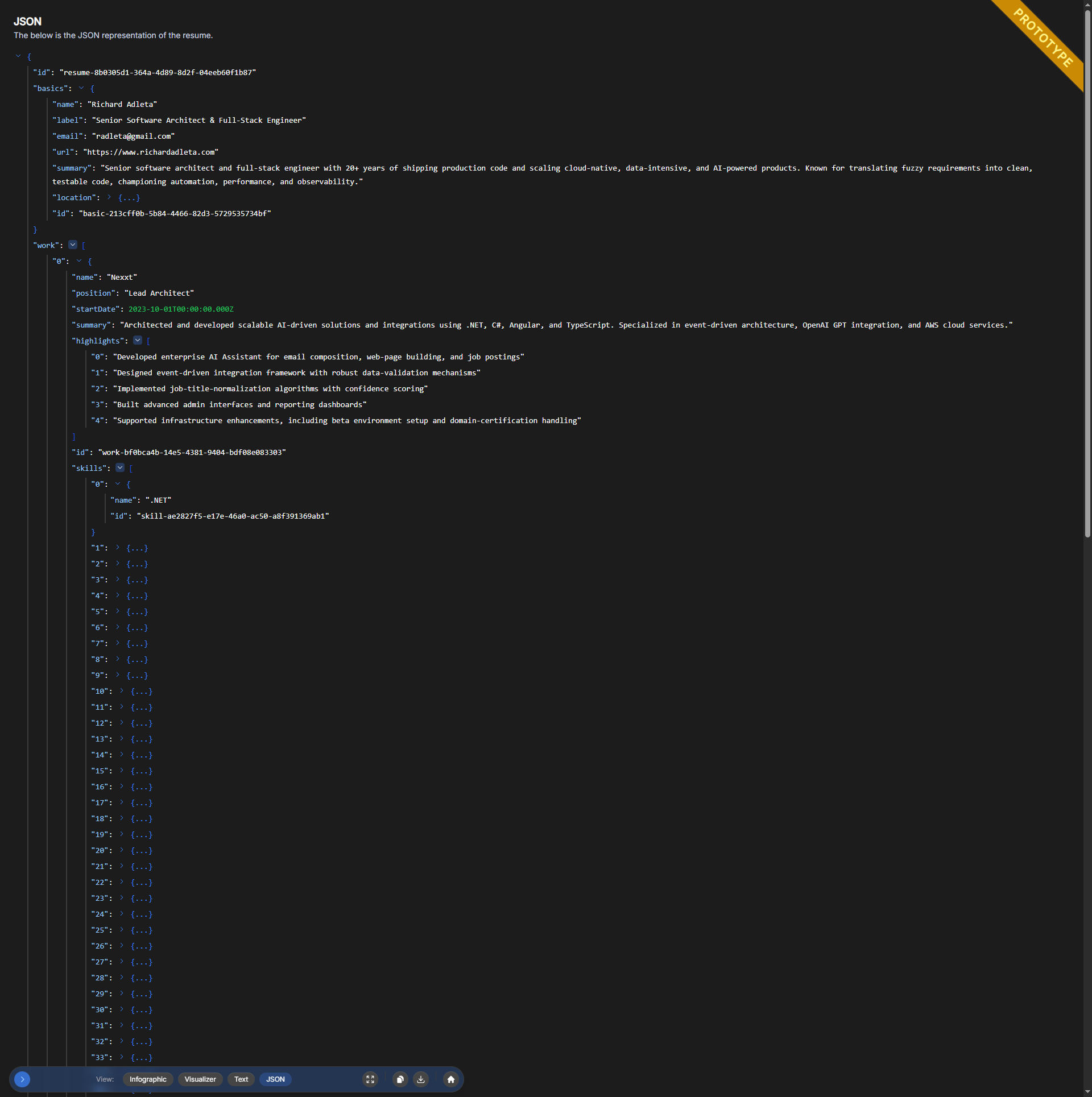
I wanted to provide a direct window into the data behind the scenes—the actual JSON that powers the entire resume experience. Observability is important: this view lets you quickly look deeper into the raw data, making it easy to debug, troubleshoot, or just understand what’s really driving the presentation.
Right now, it simply shows the core data used to render everything. But my vision is to expand this further:
All of this is built on top of Zod schema validation (with my own extensions), so you can trust that the data is both well-structured and extensible. If you want to see how the schema works, check out the documentation linked below.
Let’s talk about what powers this whole thing: structured data.
Instead of hardcoding my experience, I built the Resume Viewer around the JSON Resume schema—but I didn’t stop there.
The standard schema is a great starting point, but I wanted to go deeper. So I extended the base 1.0.0 schema to support richer modeling:
This means the Resume Viewer isn’t just a static display. It’s data-driven and designed for exploration. Want to see which skills I used at which company? Or how my expertise evolved over time? Now you can.
If you’re curious about the technical details, I’ve documented the schema system—including how I layered custom extensions on top of the JSON Resume spec—right here:
👉 Schema Documentation (README)
So, whether you’re a hiring manager, a fellow developer, or just someone who loves data, you can dig into the structure behind the scenes—and see how thoughtful modeling unlocks new ways to tell a story.
“I’ve been heads-down building production systems for years, and ironically, none of that shows up in a GitHub profile.”
This project was my way of fixing that.
To show code. To show thinking.
To give hiring teams something they can actually use and feel.
From scratch, I hand-built almost every component. The only external library? Recharts for some early data visualizations. Everything else? Custom—and proudly so.

This is very much a work in progress—and that’s by design.
I’m sharing it early, not because it’s perfect, but because I believe in building in the open and learning from real feedback. Every feature, every view, every bit of polish is evolving week by week. Some things are rough, some are experimental, and some are just sketches of what’s possible.
Here’s what’s on my radar for the next iterations:
If you have thoughts, ideas, or just want to see how a prototype grows into something production-ready, I’d love for you to follow along—or even join the discussion on GitHub.
This viewer? Just one of many systems I’ve built (and broken, and rebuilt) over the years:
When I say I build things from the ground up, I mean it.
Not just code—but platforms people actually use.
“The companies I thrive in are the ones where I can write code, build something real, and see it used.”
That’s what this is.
And if it resonates with you—whether you’re hiring, curious, or building something yourself—I’d love to hear from you.
📬 Let’s connect → radleta@gmail.com
TL;DR: I needed a resume for the first time in years—so I built an interactive, data-driven Resume Viewer in React. It’s not just a PDF: it’s a web app th...
Once upon a time, writing documentation was the part of my job that I dreaded. It was cumbersome, slow, and always felt like a chore compared to the fun part...
I’m excited to officially launch my personal website! After spending years working on various projects, leading teams, and building innovative solutions, it’...